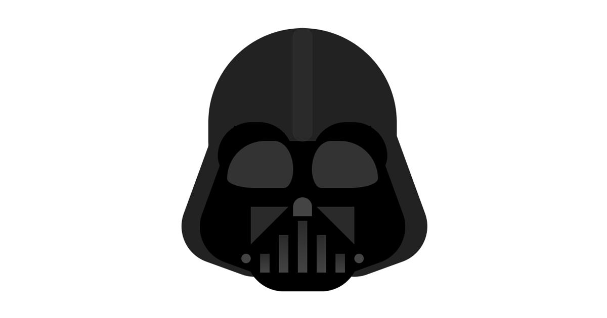
cssのみで 「ダース・ベイダー」アイコンを作成してみました。
突っ込みどころがありすぎてすみません。これが精一杯です。ご了承ください。
スターウォーズといえばダースベイダーではないでしょうか。
ボバ・フェットと同じく大好きなキャラクターです。
今までのアイコンと違ってcssの量がどんどん増えてます・・・
もっと簡単に出来るようにしたいですね。
2015/06/20
iPhoneで表示崩れしてた
原因は「rotate3d」みたいです。「rotate」にしたら直った。
ソース
html
<div id="darth_vader">
  <div id="darth_vader_helmet_back"></div>
  <div id="darth_vader_face_back"></div>
  <div id="darth_vader_face1"></div>
  <div id="darth_vader_face2"></div>
  <div id="darth_vader_face3"></div>
</div>
css
/* ヘルメット */
#darth_vader {
	font-size: 100px;
	position: relative;
	margin: 0.1em auto;
	width: 1.0em;
	height: 1.1em;
	background-color: #222;
	border-radius: 0.5em;
}
#darth_vader::before {
	position: absolute;
	content: "";
	top: 0.5em;
	left: 0.5em;
	width: 0.6em;
	height: 0.8em;
	background-color: #222;
	-webkit-transform: rotate(-20deg);
	transform: rotate(-20deg);
	border-radius: 0 0 0.2em 0.2em;
}
#darth_vader::after {
	position: absolute;
	content: "";
	top: 0.5em;
	left: -0.08em;
	width: 0.6em;
	height: 0.8em;
	background-color: #222;
	-webkit-transform: rotate(20deg);
	transform: rotate(20deg);
	border-radius: 0 0 0.2em 0.2em;
}
/* ヘルメット背景 */
#darth_vader_helmet_back {
	position: absolute;
	top: 0.6em;
	left: 0.2em;
	width: 0.6em;
	height: 0.8em;
	background-color: #000;
	border-radius: 0 0 0.2em 0.2em;
	z-index: 1;
}
#darth_vader_helmet_back::before {
	position: absolute;
	content: "";
	top: 0;
	left: 0.2em;
	width: 0.6em;
	height: 0.7em;
	background-color: #000;
	-webkit-transform: rotate(-20deg);
	transform: rotate(-20deg);
	border-radius: 0 0 0.2em 0.2em;
}
#darth_vader_helmet_back::after {
	position: absolute;
	content: "";
	top: 0;
	left: -0.2em;
	width: 0.6em;
	height: 0.7em;
	background-color: #000;
	-webkit-transform: rotate(20deg);
	transform: rotate(20deg);
	border-radius: 0 0 0.2em 0.2em;
}
/* 顔背景 */
#darth_vader_face_back {
	position: absolute;
	top: 0.5em;
	left: 0.05em;
	width: 0.4em;
	height: 0.3em;
	background-color: #000;
	border-radius: 0.3em 0.3em 0.2em 0.2em;
	box-shadow: 0.5em 0 0 0 #000;
	z-index: 2;
}
#darth_vader_face_back::before {
	position: absolute;
	content: "";
	top: -0.5em;
	left: 0.4em;
	width: 0.1em;
	height: 0.6em;
	background-color: #2a2a2a;
	border-radius: 0.05em;
	box-shadow: 0 0 0 1px #2f2f2f;
}
/* 顔パーツ1 */
#darth_vader_face1 {
	position: absolute;
	top: 0.6em;
	left: 0.1em;
	width: 0.35em;
	height: 0.25em;
	background-color: #333;
	border-radius: 0.4em 0.2em 0.1em 0.3em / 0.4em 0.3em 0.2em 0.1em;
	z-index: 3;
}
#darth_vader_face1::before {
	position: absolute;
	content: "";
	top: 0;
	left: 0.45em;
	width: 0.35em;
	height: 0.25em;
	background-color: #333;
	border-radius: 0.2em 0.4em 0.3em 0.1em / 0.3em 0.4em 0.1em 0.2em;
}
#darth_vader_face1::after {
	position: absolute;
	content: "";
	top: 0.3em;
	left: 0.35em;
	width: 0.1em;
	height: 0.1em;
	background-color: #444;
	border-radius: 0.1em 0.1em 0 0;
}
/* 顔パーツ2 */
#darth_vader_face2 {
	position: absolute;
	top: 1em;
	left: 0.275em;
	width: 0.5em;
	height: 0.4em;
	background:
		linear-gradient(to bottom, #2a2a2a 0%, #444 100%) 0em 0.2em / 0.05em 0.1em no-repeat,
		linear-gradient(to bottom, #2a2a2a 0%, #444 100%) 0.1em 0.1em / 0.05em 0.2em no-repeat,
		linear-gradient(to bottom, #2a2a2a 0%, #444 100%) 0.2em 0.025em / 0.05em 0.275em no-repeat,
		linear-gradient(to bottom, #2a2a2a 0%, #444 100%) 0.3em 0.1em / 0.05em 0.2em no-repeat,
		linear-gradient(to bottom, #2a2a2a 0%, #444 100%) 0.4em 0.2em / 0.05em 0.1em no-repeat
	;
	z-index: 3;
}
#darth_vader_face2::before {
	position: absolute;
	content: "";
	top: 0.2em;
	left: -0.1em;
	width: 0.05em;
	height: 0.05em;
	background-color: #444;
	border-radius: 100%;
}
#darth_vader_face2::after {
	position: absolute;
	content: "";
	top: 0.2em;
	left: 0.5em;
	width: 0.05em;
	height: 0.05em;
	background-color: #444;
	border-radius: 100%;
}
/* 顔パーツ3 */
#darth_vader_face3 {
	position: absolute;
	top: 0.95em;
	left: 0.225em;
	width: 0;
	height: 0;
	border-top: 0.2em solid #2a2a2a;
	border-right: 0.2em solid transparent;
	z-index: 3;
}
#darth_vader_face3::before {
	position: absolute;
	content: "";
	top: -0.2em;
	left: 0.35em;
	width: 0;
	height: 0;
	border-top: 0.2em solid #2a2a2a;
	border-left: 0.2em solid transparent;
}